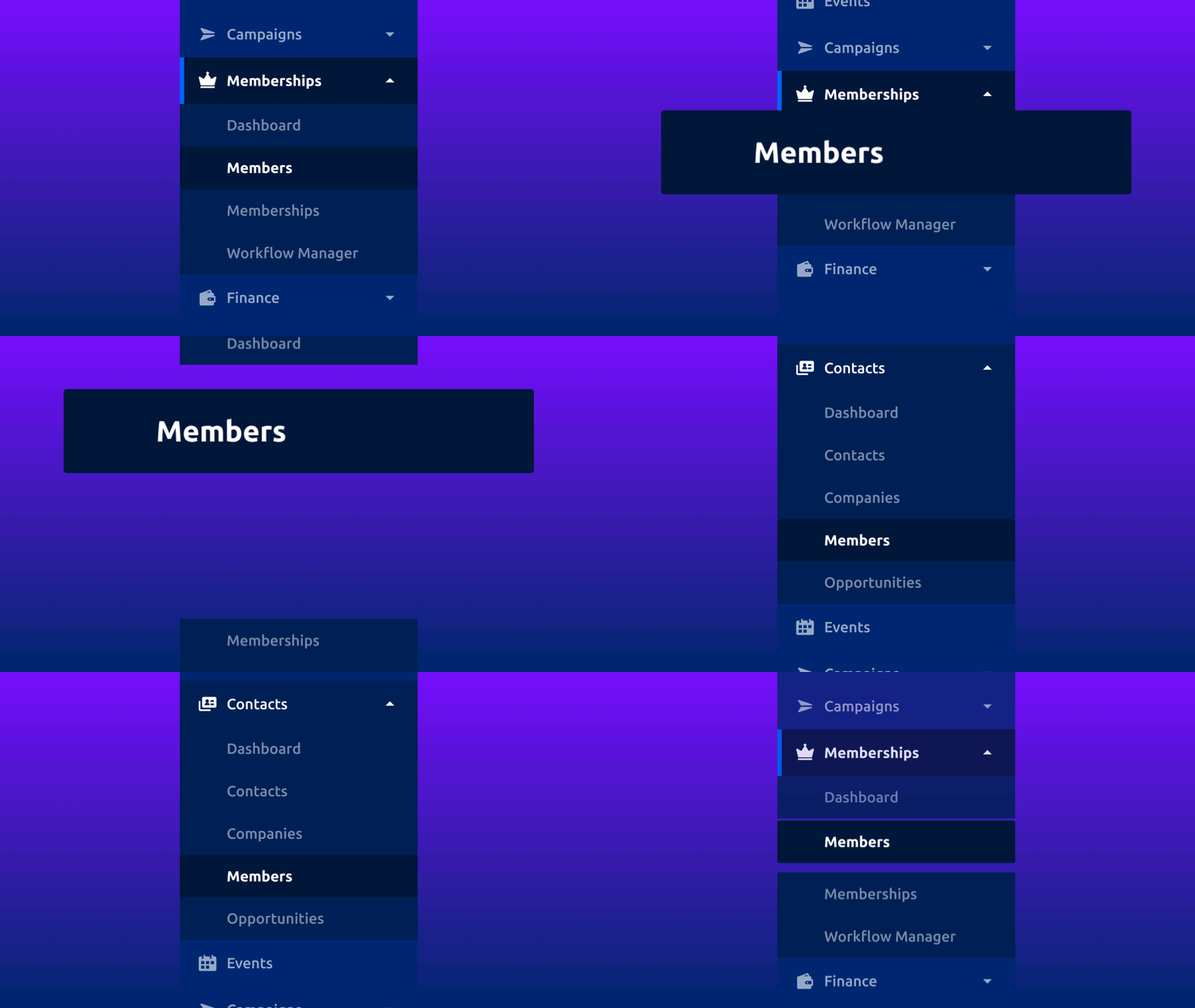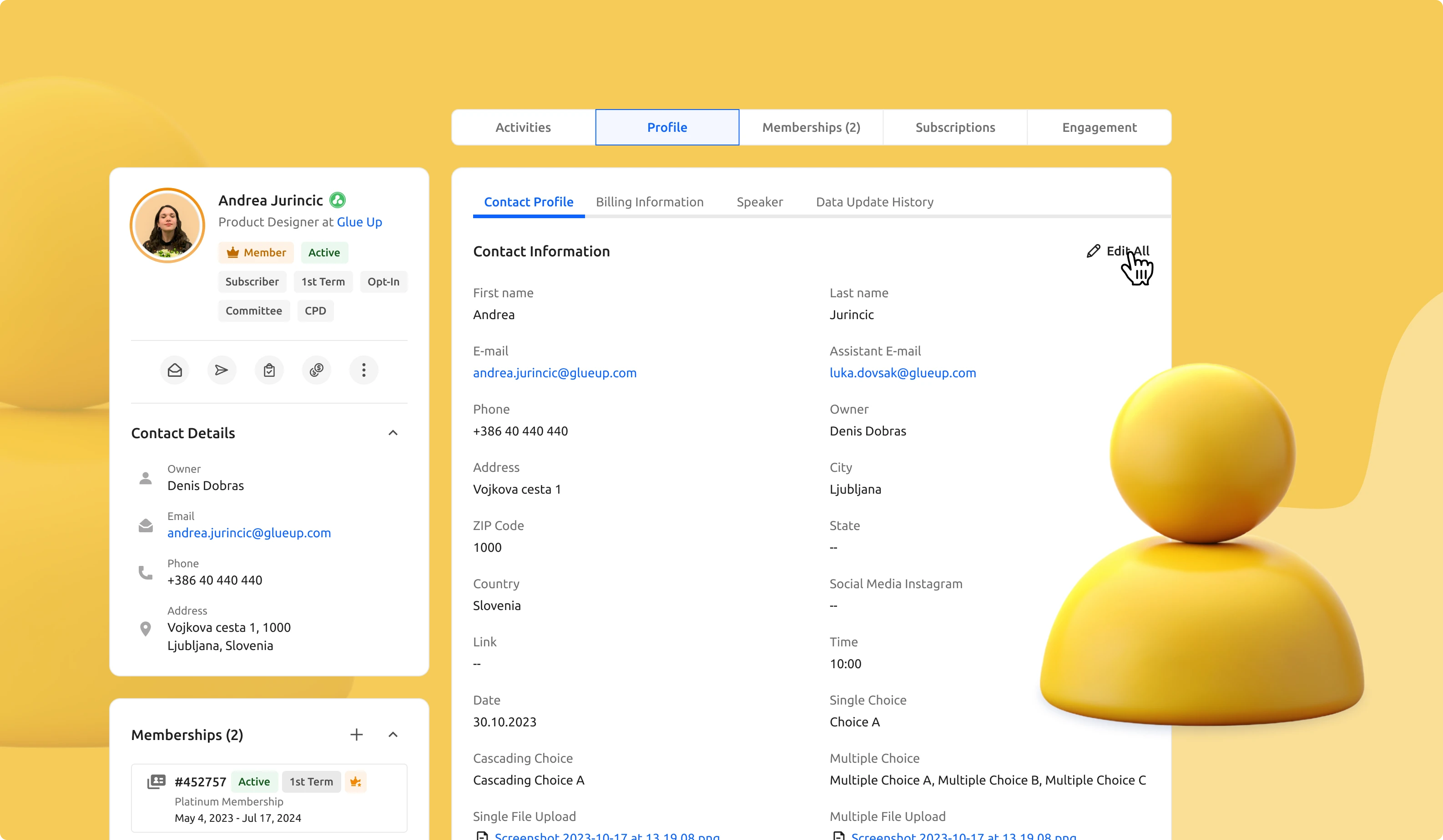
After conducting thorough research and carefully considering user feedback, we are thrilled to unveil our revamped profile section, which brings significant enhancements to both Contact and Company profiles. Alongside this, we've implemented several upgrades to how data is presented, enriching the overall user experience. Additionally, we've relocated the Members into the CRM module, further improving usability and more efficient workflow.
Let's go through all the new details and explore the redesigned elements and features.
A New Home for Members

Every contact in your Glue Up database has a different role, like being a member, an event attendee, or a subscriber, often overlapping. Members are a special type of contact because they enjoy perks like accessing exclusive pages and events, and you can track their membership details.
To streamline organization and data management, we're relocating the Members to the Contacts Module enhancing the user experience by simplifying the process of switching between member profile and contact information.
Upgraded Contact and Company Profiles

In the new profile view we upgraded the look and feel of the whole page by changing the widgets, how data is presented, and displaying membership(s) information all on the same page.
Not only did we change the look, but we also added some small, but powerful features:
- Rearrange the order of the widgets and the change will be applied locally for all the contacts;
- Hovering over specific data will show additional action that can be performed (eg. copy the email address, edit the phone number, etc.);
- Opportunities are divided into stages for better readability;
- Completed tasks are counted, but hidden;
- All data is now displayed as read-only text. Click on ‘Edit All’ to open edit mode and prevent the accident update of the information and reduce the mistakes;
- View all membership information from within the profile page where ‘See more’ will take you to the associated ‘Membership Details’ page.
Stay Tuned!
With these redesigned profiles and Members relocation, we believe it should help ease the management of data in one place. We’re always looking to make your experience of using Glue Up better. We’ll keep you updated as we ship more improvements.
For any questions, as always, reach out to our Customer Support. To learn more about Glue Up and how it can help your Organization, book a free demo today.


