
Are you planning to host a webinar, workshop, conference, or any other form of online event that needs people to register? You've come to the right place!
However, keep in mind that having a smooth registration process encourages people to attend an event. In this way, you can deliver the most value to others while maximizing leads generation and increasing revenue at your event.
It is normal practice for interested participants to give out personal information like names and email addresses. But today, there are software and tools that offer opportunities for creating registration forms tailored to your event type and best suited for obtaining more accurate attendee information during registration.
If you are wondering how to build and customize an event registration form, you’ve come to the right place. In this article, we will discuss its benefits, strategies to optimize its efficiency, and best practices to increase event attendance.
Quick Reads
- Benefits of Online Event Registration Forms
- How To Optimize Event Registration Forms
- Effective Ways to Create the Perfect Event Registration Forms That Convert
Benefits of Online Event Registration Forms
A recent survey reveals that over half (52%) of the full-time, office-based respondents wanted to eliminate the need for paper records in the next few years.

Most companies follow paperless processes today since they’re more environmentally friendly and cost-efficient. Once they have made the switch, they would need a solution that automates event registrations to make online data submission secure and seamless.
Here are the other benefits of using event registration forms:
1. Saves Time by Automating the Process
Save a considerable amount of time collecting information using registration forms. They reduce manual processes as they allow you to quickly and easily gather attendee information and store them in one place.
Furthermore, participants can sign up or register at their convenient time. As an event organizer, specifying the start and end date during the event planning phase is essential. It gives registrants enough time to proceed and finish the registration process.
2. Simplifies the Procedure and Is Easy to Build
An online form for an event is a straightforward way to collect attendee data quickly and efficiently.
It contains different types of input elements like text fields, radio buttons, and checkboxes for users to easily provide the required information and select one option from a set.
The best form builder tools can offer you a variety of distribution options. They often provide an auto-generated embed code that you can add to a website or the ability to send a link to the form via email or text message.
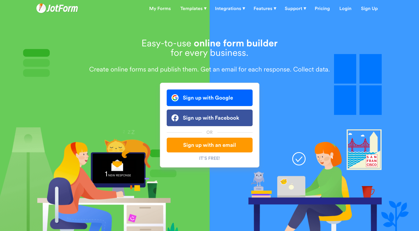
JotForm is a free online form builder that allows you to create registration forms. All you have to do is to choose from its registration template gallery and integrate the online form with any payment processor if you need to collect fees.
3. Obtains Accurate Data to Make Data Analysis More Reliable
Preparing an online form for an event can help improve efficiency and increase event registrations. Moreover, it guarantees that you get accurate data to meet event objectives.
Most registration forms now are mobile friendly. They automatically adapt to the sizing and layout of mobile devices and tablets legibly. For this reason, creating mobile-ready event registration forms can increase potential attendee reach since mobile users can easily access and fill them in anytime, anywhere.
What’s more, creating event forms online ensures that the events team presents the same questions every time they get personal details. Thus, it reduces the chance of missing information that could result in losing event registrations when you include all required details.
4. Gives You Full Control Over Every Customization You Need
You are in complete control over an online registration form's creation when dealing with theme customization, the number of required fields, and their placement to support your organization's branding and conversion strategies.
Keep in mind that a professional-looking event form is the first choice, especially if you're aiming for high performance than lousy ones that ask more than what's necessary.
Therefore, it helps to create a well-designed event form to establish trust. Users can instantly feel safe and confident to give away their data when you use this approach.
When designing one, choose fonts and colors that match your organization's brand guidelines. Then, customize it in style and optimize it for conversions to achieve your event goals and objectives.
If you want an online registration form for events that can result in a greater return on investment, go for a reliable event registration software that lets you quickly optimize the format, design, and question fields.
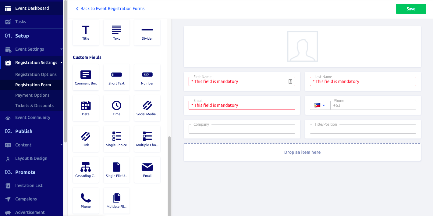
Glue Up’s Event Management Software lets you build and customize event registration forms. It gives you plenty of options to use different fields to collect the data that you need.
5. Secure Data Storage
An online event registration form allows you to capture data in a convenient and safe environment.
It reduces paperwork and saves you a lot of time when processing data. Once the information has been received, it will be securely stored and accessible for selected users.
Therefore, it gives peace of mind compared to printable event registration forms that could be misplaced or lost.
There has been an increasing need for online survey tools to assist event planners in gathering post-event attendee feedback. Be sure to check out Glue Up’s Surveys Solution to get the most valuable feedback by choosing any of its survey templates and collecting data automatically.

How To Optimize Event Registration Forms
Learn to maintain simplicity in the online registration form by producing one that compliments or matches your logo on the registration page. Minimize links and irrelevant content to ensure that everything offers value and relevance to the audience.
We suggest using a heatmap that can work as a data visualization tool to help you understand how your event registration forms are performing. It’s designed to optimize registration forms to give you a comprehensive view of users’ behavior on a page—what they click, how far they scroll, and what gets their attention.
Heat maps offer a visual view of data, which helps you analyze it at a glance. This is useful, especially if you’re not accustomed to evaluating large data.
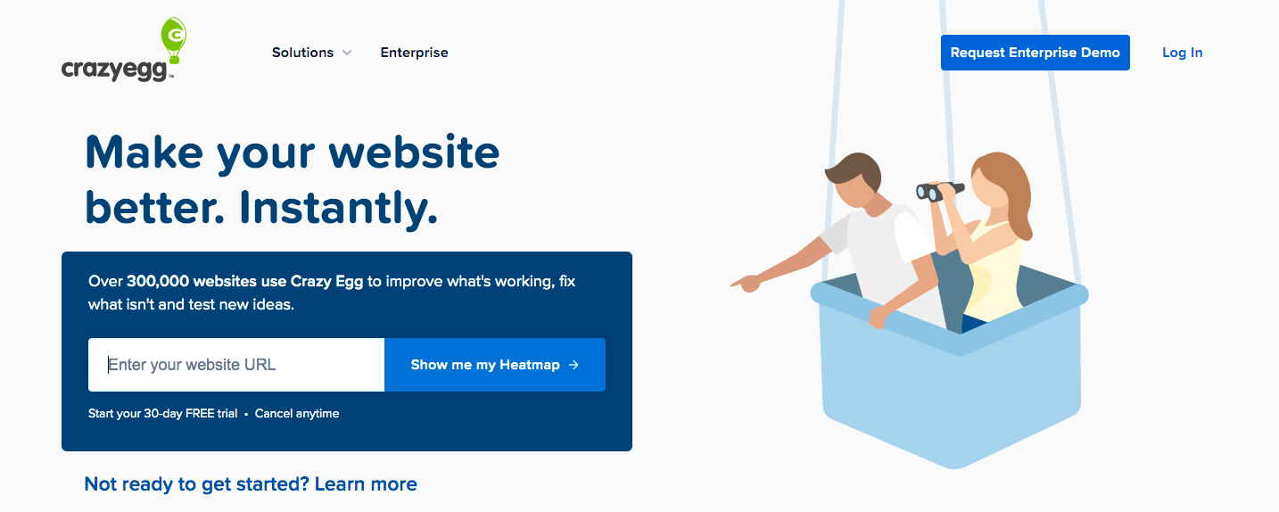
CrazyEgg is a heatmap tool that lets you segment and filter data. For this reason, it will be easy to track the different types of users on your page and monitor their behavior.
The registration page should be on your landing page and should not be listed on another website to achieve the best results. This way, you won’t lose customers or clients from your website before they even get to sign up.
Double-check all form fields on the registration form to see if they work properly and are designed professionally.
When optimizing it, it is important to think about your call to action to evaluate its strength. Using words like ‘send’ and ‘go’ on the call-to-action button is better than the word ‘submit’.
Effective Ways to Create the Perfect Event Registration Forms That Convert
1. Keep It Short and Simple but Impactful
Keep registration forms simple and make sure to include all essential details for the event. Write all the necessary questions clearly and concisely. When you can create a short but thoughtfully organized form, visitors will stay longer and be encouraged to provide answers.
2. Make It Scannable to Get More People to Read

Users should be able to tell the required information at a glance. Also, they should easily understand its purpose and the way they can submit it.
A valuable and scannable registration form should take note of the following:
- Balanced text and colors. The text needs to be short and easy to read. According to a study, there is a stronger preference for traditional dark on light text-background combinations for its readability.
- Good grouping and spacing. Group attendee information and payment details accordingly to eliminate confusion. Opt to create shorter blocks that are easier to digest than one long block. Use smart spacing to support the field they explain.
- Effective call-to-action (CTA): Keep your CTAs short while encouraging users to take action. Create a sense of urgency using words like “Register Now” or “Reserve My Slot” on the CTA button. Once they’ve clicked it, end it with a submission success message to let users know that a form is properly submitted.
3. Only Ask What’s Necessary

Grouping event form fields logically can help users understand the required information faster. For this reason, the position of questions should be similar to those you would have asked in person.
For example, it’s advisable to ask a person’s name before their address. It should be followed right away by their zip code, which you would not inquire about five questions later during an in-person conversation.
4. Provide Visible and Specific Error Messages
Configure a registration form to check and validate attendee responses in real-time. In this way, they will find out right away if they’ve made a mistake in filling out the form even before submission.
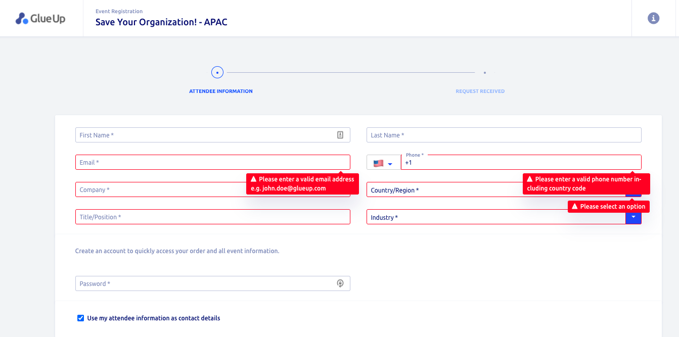
Error messages should be noticeable at a glance. Additionally, the mistakes should be displayed near the fields with errors.
Use colors, graphics, and text notices to highlight errors attendees made when filling out a particular field. Make sure to present information on how to fill them out correctly.
In line with this, a form can also indicate if a username requires letters, numbers, and special characters.
5. Make Forms Keyboard-Friendly
An event form should support different types of keyboards when sending out the registration information.
- On desktop. Users should be able to access a form and fill out each field without the need to click the mouse. Advancing from one field to the next should be easy while having the ability to use tabs or enter to move around.
- On mobile. The keyboard type should meet the data needed. The alpha keyboard should be activated for letters, while the numeric option should be displayed for numbers.
According to Google, you have to ensure that both are implemented consistently all throughout, as users tend to appreciate it more.
6. Set Up Event Form Submission Confirmation

Page speed is important as it directly affects conversion rates. According to studies, there’s a positive correlation between fast page speed and better conversion rates.
In fact, website conversion rates increase, on average, by 1.9% for pages that load in 2.4 seconds.
Therefore, it’s critical to develop a fast web experience to engage interested participants, encourage them to stay, and finish the registration process.
Once guests have submitted their event registration forms, you should inform them that they are already being processed through confirmation messages. These are some examples of confirmation types you can use:
Success message. This is the default confirmation type in event registration websites. When a site visitor submits an online registration form, a simple message confirmation will appear letting them know their registration was processed.
Thank you page. This confirmation type will take site visitors and lead them to a specific page where you can thank them after filling out and submitting a form. One way to utilize a thank you page is to offer relevant content material or to drive more social media engagement.
Website redirect. This technique is used when you want to redirect your visitor to a different website.
Convert Visitors Into Event Registrants
Online event registration forms allow you to automate attendance tracking and monitoring for reduced paperwork, improved efficiency, and increased attendance. In fact, Book a demo of our Speed Networking Software, and we’ll show you how they can make new connections remotely and expand their network using an all-in-one solution.


