Event websites are a great way to make a first impression to potential attendees, and they also act as the home base for all things about your event, including the time, place, schedule, ticketing, speakers, sponsors, and so on. However not all event websites are the same, and the easiest way to go about it is to find the right template for your event’s size or purpose.
Large Events, Conferences, & Expos
Large events are one of the most complex types of events out there. They usually run more than one day, and sometimes running multiple activities, also known as tracks or sessions, at the same time as others, making it very hard to manage or even deliver conceptually on a website.
1. Cappuccino
Main Elements
- Multi-track Banner
- Customizable Footer & Header
- Session Tags
- Countdown
- Sponsors/Partners Section
Event templates are pre-designed with the structure of your event in mind, and the Cappuccino event template is a feature-packed template meant for long, large, and complex events.
Cappuccino is ideal for major events like annual conferences, summits or congresses, which includes a countdown timer, customizable footer & menu layout, session tags, event statistics and more options to show your biggest events in the best light possible.
Stroopwafle Frappuccino
Main Elements
- High-Impact Banner
- Multi-track Agenda
- Sponsors/Partners Section
- Map
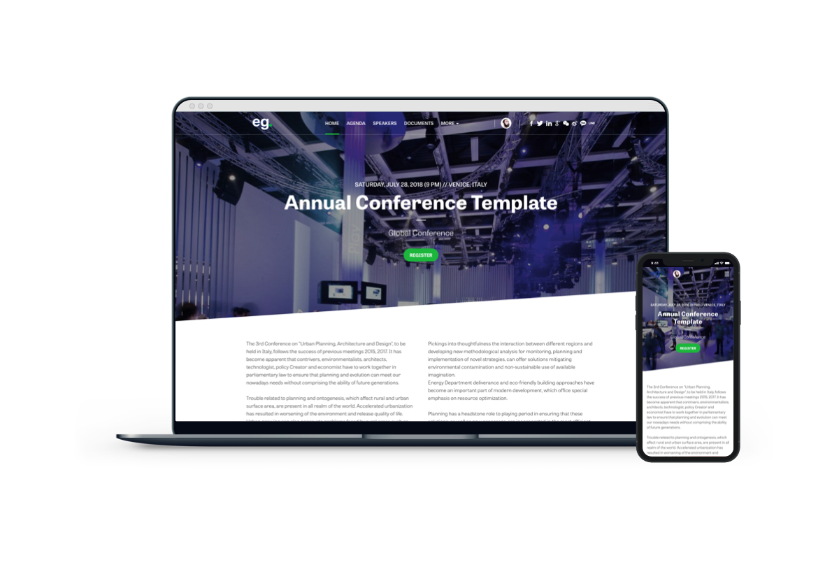
Stroopwafle Frappuccino is another type of long-form event website template that focuses on telling the story of the event starting with the header image call to action, and then moving from most pertinent to least as the user scrolls down. Like Cappuccino, the template is meant for large events, and so includes some similar elements like multi track listings and so on.
It’s color settings focus on a primary and a secondary color that help accent brands who typically have a primary color, and in doing so helps to accent the entire template to your branding.
Medium Sized Events & Conferences
Medium events and conferences are less stringent on the complexities that plague large events, but are often times in need of the same elements as large event templates use, but with a more succinct focus on the topic at hand rather than multiple topics.
Iced Latte
Main Elements
- Important Information Highlighted
- Full Menu at sight
- High Visibility Organizer Logo
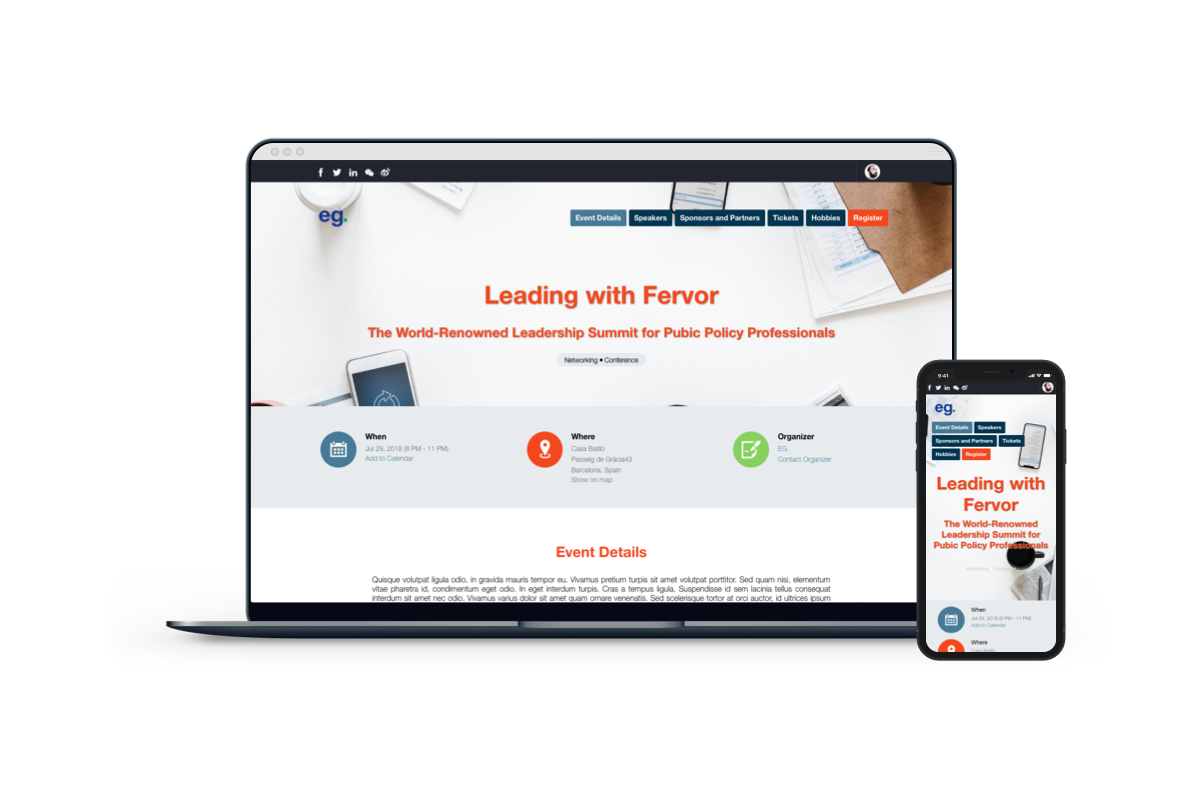
Ice Latte is a template that aims to be simple while leveraging the power of a high visibility hero image in the main home page. Doing do allows there to be a relatively simplistic menu and content presentation that helps to deliver the pertinent information about the event at first glance, and helps to deliver information through a customizable menu.
With support for event communities, this template is great for medium sized events that don’t run multi-track events, but are still large enough to warrant community management and access.
Caramel Macchiato
Main Elements
- Important Information Highlight
- Full Menu at sight
- Large Data
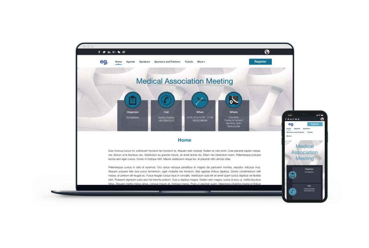
Caramel Macchiato is an event website template that focuses on a more ‘professional’ vibe, but keeps things simple by having all the important event info actually visible in the header image itself. The template focuses on post-event reviews by allowing for long-tail pages that can highlight events and pictures from the event similar to a social feed.
Cafe Cubano
Main Elements
- Highlight Speaker
- Highlight Organizer Logo
- High Visibility Banner
- Location Hiding
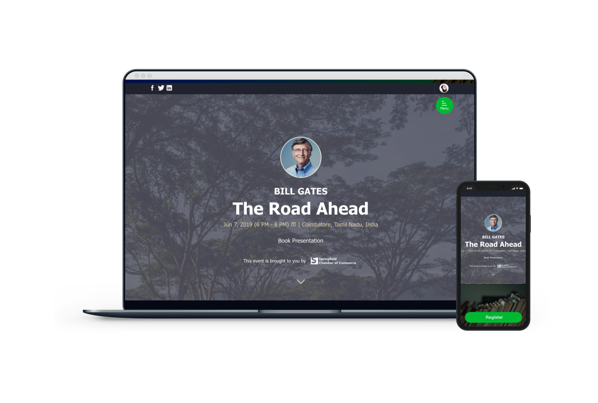
Cafe Cubano template is hyper-focused on speaker centric events. While most events will revolve around a certain topic, events where there is a single speaker are quite common as well. Due to the nature of a single speaker, multi-track or multi-day templates are not needed, and a simple template will work wonders to keep the focus on the speaker.
The template if you notice by now follows a trend of having a high-visibility hero image to make the page attractive, but placing the head-shot of the speaker at the top to make it very clear the purpose of this event.
This template also includes the ability to hide the location as some speaking events could be online courses and webinars.
Cafe Mocha
Main Elements
- Countdown
- Fist Glance Add to Calendar
- Highlight Agenda
- Showcase Tickets
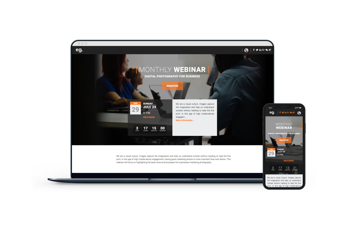
While Cafe Cubano can be rigged into a seminar focuses template, Cafe Mocha has the opposite use case, where it is used with a core focus on online-only or webinar events, but is sometimes used for in-person events. The template is a sister-template of Cafe Cubano so nothing about it should surprise you from the above, except the non-speaker focus, and taking on a more traditional event web template format.
Small Events
Small events are in need of a more focused experience in order to deliver value to visitors. With this in mind templates for smaller events will need to buck normal event website trends in order to deliver a better converting experience. This means less focus on schedules typically, and more on the content provided at the event. Larger events are likely by word of mouth understood what topics will be presented, maybe speakers are well known already. But at smaller events, it may take some convincing from the website what the content is and how it’s valuable.
Espresso
Main Elements
- Custom Banner
- One-Pager
- All Speakers at sight
- High Brand Visibility
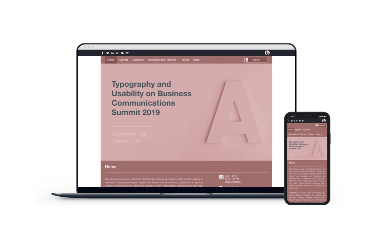
Espresso is a template that is a single-page website for events that aims to only have the most pertinent information about the event in one place with minimal navigation blocking a visitor’s way from reading. It is in this case a more small-event focused template but has been used to help supplement medium sized events as well.
Americano
Main Elements
- Venue Highlight
- Card Single-page Layout
- High Mobile Responsiveness
- Super clear Agenda
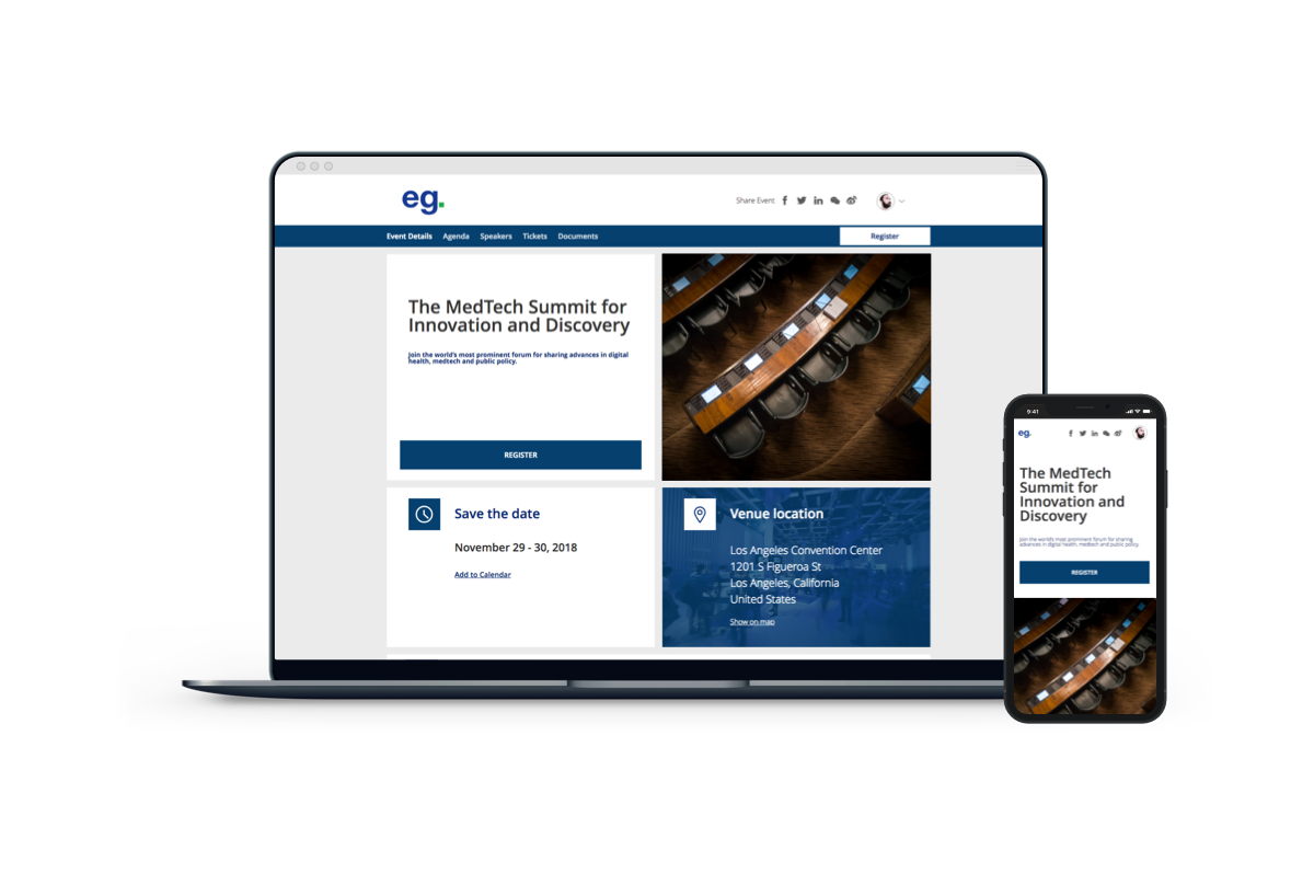
The Americano template is another small scale event website template that bucks the high visibility homepage images and goes for a more balanced setup of the content that allows more use of images as a tool to complement to the content. It has all your event needs in a single page layout with a specifically good mobile responsiveness due to the balanced format leaving content more fit for small form factor screens.
Lemon Tea
Main Elements
- High-Impact Banner
- Multi-track Agenda
- Sponsors/Partners Section
- Map
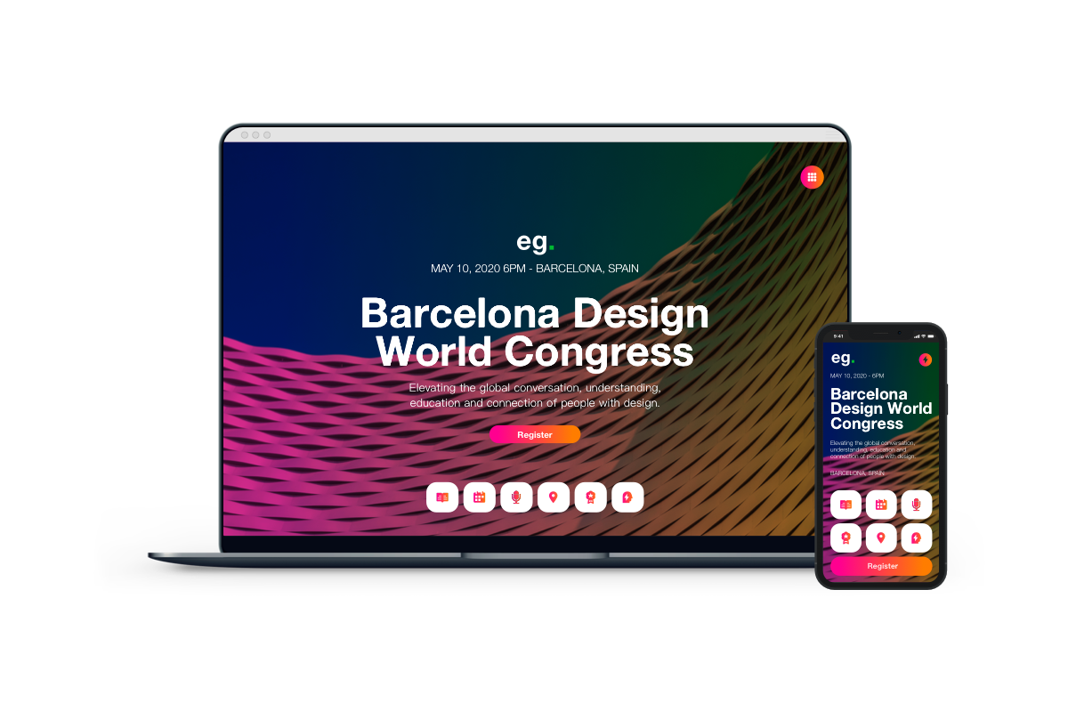
Lemon Tea is by far the most technically functional template for small events. Another one-pager with a special element that follows the reader no matter how far they scroll down with all the event details and a call-to-action for registration. This template is ideal for visitors who may not have heard from you before and require a very clear and persistent CTA in order to convert for more registrations.
Noisette
Main Elements
- Easy Set-up
- Showcase Event Tags
- Small Picture
- Simple Layout
- Showcase Organizer
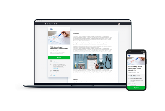
Noisette is a great template for small-form events that need a professional look and feel. With a fairly plain but clear header, it takes a focus more on info-delivery than visual pleasantries. Perfect for events where attendees need to be informed and prepared beforehand like courses, meetings and private conferences. This template however has been seen used in a myriad of other event formats with great feedback and so strictly speaking this is a safe-bet template should your creative skills not be up to par for other templates.
If you’re looking for a website template or want to build your own, book a demo with us today and we’ll show you how you can make your own event website in minutes.


