Standing out is extremely important in an industry like event planning. The competition is fierce and constantly evolving, so you have to take any chance you get to stand out. A good way to distinguish yourself from your competitors is by investing in a good visual identity.
The whole branding of your company should be done by professionals who understand your industry and the target audience, but there should be a special focus put on the visual part of it - logo in particular.
It is often the first thing your potential clients see and judge you by. Since aesthetics are so important in the event industry, your presentation should be up to the part. In this article, we’ll show you 4 important steps you need to take in order to brainstorm the best logo for your business.
![]()
Source: Pexels
Quick Reads
Try to Strike the Emotional Cord
Most customers will reach out to you when they want to celebrate a specific life event, like a wedding or birthday. Even if you’re specialised in corporate events, you’ll still be hired for joyful occasions and it’s important for the clients to make that connection as soon as possible.
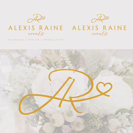
You need to evoke positive emotions in your clients. It could be done through pictures, icons, fonts, colours and more. A lot of people in this industry will do a mix and as you can see in the example below, the logo includes a heart and a soft cursive font reminiscing of femininity.
The golden colour used in the design symbolizes luxury, extravagance and gives the viewer a sense of tradition and wisdom. These are the values you’ll want to communicate if you’re specialised in private events.
 Source: 99designs
For corporate events, you’ll want to choose a more contemporary design that is clean-cut yet still creative. The biggest deal maker you need to have in the MICE business is your understanding of technology and how it can be used in organizing high-tech events like product launches and conferences.
Sell Your USP
During your branding stages, you’ve surely analyzed your competitors and found what makes you special and unique and sell it everywhere you can, from social media to display ads. It could be your expertise, vast experience, price, number of venues and vendors you collaborate with, or something else. Whatever it is, make sure it’s front and centre.
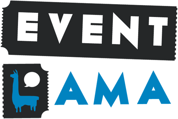
Be clear about the service that sets you apart and try to convey your niche as clearly as possible. As soon as you see the logo in the next example, you know that they provide a ticketing service. Consider the different associations your potential customers may have when you’re creating a logo since it needs to be simple, yet pack a punch.
Think About Colours
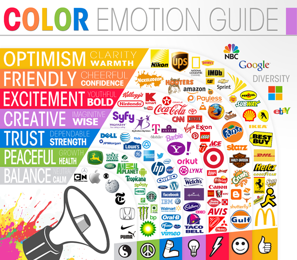
Every colour tells a different story and every industry tends to have a set colour scheme. There is interesting psychology behind human reactions to different colours that you can use to your advantage.
For example, red is one of the first colours human eyes could see and to this day remains a colour that quickly grabs attention. It symbolizes passion, love, confidence and warmth. Orange is also a warm colour that symbolizes health, vitality and energy.
Yellow could bring associations of positivity, happiness and such. The mentioned colours are often used in product design and branding because they’re attention-grabbing and evoke positive emotions.
 Source: The Logo Company
Colder tones are more reserved and have a calming effect on people. As such, blue brings tranquillity since it represents the sea and sky on a clear day. Green symbolises nature, money and good luck.
Purple, on the other hand, symbolizes femininity, luxury, creativity and spirituality. Colder colours are considered to be more professional and that’s why you’ll see them in the branding of higher-end companies.
Their first choice are neutral colours, like black, white, grey and beige. White symbolizes cleanliness, peace and goodness, while black stands for power, elegance and formality.
Choosing the right colour can be a process, so give yourself time to select a palette of shades that go great together.
Research Your Competition
The event industry isn’t tied down to a single location like other businesses are, so make sure to research the competition in your micro and macro location. Analyze their branding and see what the industry standard is.
You need to know how to create a logo that has components people expect to see in an event planner’s logo but stands out as well. Make sure you’re not too similar to anything already on the market.
Understanding сustomer analytics can increase profits, higher customer satisfaction rates, and positive brand recognition among potential buyers of a company's product or service.
We suggest that once you design your logo, you have someone outside of the industry look at it as well so that you get a well-rounded opinion. With everything you do in the event planning industry, you want to stay professional.
That goes beyond your logo and seeps into the way you communicate your brand messaging outwards. Make sure your event proposals, social media and website are all looking immaculate and professional.
Your logo should tell a story and have an inviting presence that captures the attention of your clients and makes them want to find out more about your company. Once you create a visual identity for your business, stick to it.
Don’t change it up every so often, thinking it will bring in more clients, because it will only confuse your existing clients and undo any brand awareness you have built.
Author Bio
Petra Odak is a Chief Marketing Officer at Better Proposals, a simple yet incredibly powerful proposal software tool that helps you send high-converting, web-based business proposals in minutes. She's a solution-oriented marketing enthusiast with more than 5 years of experience in various fields of marketing and project management.

![Advantages Of Paperless Board Meetings [+ Tips] Advantages Of Paperless Board Meetings [+ Tips]](/sites/default/files/styles/all_blogs_block_img_384x192/public/image_1578.png?itok=Ah-vnnvq)
![PayPal for Nonprofits: A Guide to Accepting Donations and Managing Your Money [with alternatives] PayPal for Nonprofits: A Guide to Accepting Donations and Managing Your Money [with alternatives]](/sites/default/files/styles/all_blogs_block_img_384x192/public/image_1807.png?itok=ujDAsFNj)