
What Is One Pro and Con of a Single Page Website?
A website is a part of the blueprint for your brand and business. But there are several options to consider when you are building a website. From faster loading times to SEO limitations, there are several things to consider when deciding on single-page websites. To help you decide whether or not a single page website is right for you, we asked 70 Founders, CEOs, Marketing and Design professionals this question for their best insights.
Simplify Your Message
A one-page website provides a straightforward approach to the organization with clear messaging, highlighting key selling points. This creates an easy-to-understand user-friendly experience for potential customers and a better opportunity for conversions. A one-page website consisting of an overabundance of text and unclear CTAs will ultimately frustrate users and deter them from following through with the purchase.
Shahzil Amin, WellBefore
Optimization for Mobile Users
There’s no denying that creating a single-page website is a bit contrarian. However, the idea itself does have some merit as it can work really well in certain cases. For example, let’s say you run a fashion business that only sells five items of clothing. Do you need 100 pages, or could one page suffice? Because fashion relies so heavily on captivating your audience with compelling photos, a single-page website abundant with images could be effective. If you run a business whose clientele predominantly purchases your products via their phones, a website with one long page optimized for mobile conversions with countless scrolls might be a suitable option.
Mike Krau, Markitors
Balancing Visual Appeal vs. Scalability
Pro: Works well with images. Since all your content is on a singular page, it allows you to place a variety of high-quality photos onto it and give your site visual appeal. Con: Limited Scalability. The only way to increase your content is to make the page longer, which results in more scrolling for the user. This can often make it unappealing and confusing to navigate the website's information. An option is to replace existing content to make sure the length of the page is the same. This results in limited content.
Connor MacDonald, Ridge
Increases in Retention
A one-page website is effective because it holds user retention for longer on the webpage. The longer a user stays on your site, the higher probability they will use the interactive features on your site, such as subscription options and shopping carts. The con of a one-page website is that organizations and companies with multiple special interests cannot substantially include all of its information while being clear on their mission. People trust organizations that are as transparent as possible.
Randi Shinder, SBLA
Higher Volume of Customer Inquiries
One of the biggest pros to having a one-page website is that, with limited information, you'll have more folks that are tempted to reach out to ask questions or for greater detail of what you are conveying on your website. On the other hand, having less means that you’ll have a higher volume of questions to answer or even lost sales because folks are not able to see exactly what you do.
Zoe Waters, Necessary Behavior
Limited Space for Details
A benefit of a one-page website is that all your information is positioned in a specific order, making it easier for your audience to navigate your website and get all the information they can get when they interact with your brand. It’s easy to scroll through and doesn’t take much time to find what you’re looking for. A con of a one-page website (and one of the main reasons that our law firm doesn’t use this design tactic) is that there is only so much information that you can put onto one page before it becomes overwhelming for your site visitors. Including in-depth content such as blog posts, news articles, all our practice areas, etc., requires more pages to allow customers to navigate directly to where they want to go, rather than needing to scroll through tons of content to find what they’re looking for.
Peter Horne, Geoff McDonald and Associates
Faster Loading Times
One-page websites are super-fast loading which anyone who works on websites will tell you is important. The longer somebody has to wait for your site to load, the more likely they are to leave before doing whatever you want them to do. However, part of the reason they load so fast is that there’s less material to load. This aspect I don’t like as much. On the other hand, limiting how much content you present to visitors can also restrict your ability to communicate with them effectively. It’s a trade-off of website performance for content effectiveness. I like to think that there’s a happy middle where your website loads fast enough for people to stay while still providing effective content.
Francesca Nicasio, Payment Depot
Get your association, chamber, or nonprofit website assessed quickly and easily with the Glue Up and HubSpot website grader. Receive scores for performance, security, mobile optimization, and SEO, along with practical improvement tips. We also offer a free consultation to help you enhance your website's functionality and presence.
More ‘Maintainable’
The pros of building a single-page website are that you separate the front end from the backend and most of the front-end frameworks like Angular and React provide a very dynamic way of loading pages and components. This provides a seamless experience for the users who use the website, also it separates the front end from the back end which means the software is more maintainable from an operational point of view.
Rahul Mohanachandran, Kasera
Hard to Communicate Clearly With Less Content
There isn't much content to read on these sites, which can be frustrating for those looking forward to reading something more substantial than just text links.
Justin Ehrhardt, The Bearded Marketing Pro
Great for Purpose-Driven Sites
A single-page website is a great option as a landing page for PPC and email-driven campaigns. They are easy to put up, simple, allow for a good flow of information and storytelling, and are very responsive friendly.
Sebastian Schaeffer, Blog Rolling
Requires More Design Resources
Of course, cramming everything into one page won't increase user engagement if the page isn't well-designed.
Bram Jansen, VPN Alert
Reduces Content Overwhelm
A single page website can be great for certain types of businesses. If you're a coach or services-based company relying on direct marketing tactics or have a single product you're selling, a simple one-page website can help you convert more visitors by reducing content overwhelm. Single page sites are great at increasing conversions and quickly communicating the value proposition of a product, brand, or service.
Sam Rexford, Chill Reptile
SEO Could Take a Hit
Because you have to be so picky about what shows on your single-page website, your SEO may suffer as a result. It will be extremely tough to rank for more than a few phrases/keywords when your demands change and you need to rank for different phrases/keywords. Sure, you could build a separate area for blogs and link to them from your single-page website, but it would contradict the idea of having only one page. It's not easy to master SEO.
Erwin Caniba, VPN Thrive
Better Link Authority
Having just one page for a website allows your site to have a better link authority. The reason for this is because instead of having links being spread out across many different pages, it is all concentrated on just one page.
Thanh (Wayne) Dang, The Daily Tourist
Page Speed Will Suffer
A website that loads faster converts faster and better, just remember that. Single page websites typically do not offer that due to the usual abundance of multi-media elements such as high res images and videos.
Mark Balliet, Mentality Designs
More Expensive to Market
single page websites do require paid advertising, or some other direct marketing campaign to drive traffic to the site. They are not very good for driving traffic through organic SEO, as it’s hard to rank high in a SERPs with such few content or links.
Sarah Jolly, Jolly Creative Agency
Better for Single Ideas/Non-Commercial Use
Single page websites are better for single ideas or non-commercial use. However, if you are building a website for ecommerce, it’s better to have a multi-page website to not overwhelm users on one page. They are good for campaign ideas, one-off deals, or other means to promote products separately from brands, or just singular product-based sales. Single page websites could also utilize the space they have to minimize and maximize different features so users could focus on different aspects of one page that would normally go on multiple pages.
Cody Iverson, Viscap Media
Hard to Develop a Content Strategy
The website may seem too simple, which may discourage some users due to a lack of information. It takes lots of planning and is more expensive to deal with content marketers and writing agencies.
Harriet Chan, Coco Finder
Not Ideal for Multi-Channel Marketing
If you are trying to direct people from specific sources to certain areas, this can make it more difficult. If you have multiple programs or offers, you may not want to present them all at once.
Sequoia Craig, sequoiacraig.com
Can Easily Pass the 15 Second Rule
The number one advantage of a single-page website is its convenience. Readers and visitors can find everything they need on that one page, they don’t have to jump from one page to another just to find the content that they need. It means your website will pass a 15-second rule and make users stay longer and explore more on your offerings.
Chris Von Wilpert, Content Mavericks
Target a Mobile-specific Audience
The great thing about a single-page website is that it's very compatible with mobile, which most people are on nowadays. They can also target a more specific audience, which is a great strategy for advertising.
David Stellini, AllFront.io
Web Analytics Challenges
Difficult to track analytics across the site as you just have one page which simply means you will collect data from your users on the usage, likeability/dislikeability of your website.
Ella Hao, WellPCB
No Keyword Cannibalization but Lost Backlink Opportunities
You won’t need to worry about any keyword cannibalization, as there will be no pages competing against each other. On the other hand, you lose opportunities to put together helpful resource pages or blog content that can also gain backlinks or relevancy.
Kristine Thorndyke, Test Prep Nerds
Limited Growth Opportunities
There's a lot to consider when you opt for a single page website. You are pretty limited when it comes to marketing strategies, especially SEO which can seriously hamper your growth in terms of rankings and traffic.
Robert Johnson, Sawinery
No Content Cluster and Internal Linking Opportunities
The major Con for a single page website is there's always a challenge in SEO to dominate on SERPs because you don't have the content cluster which is the supporting content, no opportunities for internal links. Cluster is very important so that Google knows that you're the master on this topic which you're trying to rank.
Jack Altmen, Think Orion
Distracting
But if there is a lot of information provided on a single page then it can even be confusing and distracting.
Lewis Amin, Net Influencer
Great Conversion Rate Optimization, Not for Product-based Businesses
Because having a single-page site means marketing is done using one/two customer's pain points. Thus it becomes that much easier to optimize the site according to it. Single page websites take comparatively less time to set up and maintain as websites with multiple pages always have to deal with regular updating of content. Single-page websites are great for agencies selling their services. But not great for product-based businesses which may need multiple pages of information to communicate with their customer base.
Vignesh Wadarajan, VigneshWadarajan.com
Controls the Narrative
A single-page design allows you to control how your users experience your web page. They check out the data the way you want them to. With a more convenient page-based design, the user may easily roam around on your site without knowing they're missing any significant information.
Olivia Tan, CocoFax
Better UX and Time Spent on Site, Difficult to Analyze
Single page websites are highly mobile-friendly, and the users tend to have a better UX as they have to scroll only once to view the entire website. Also, that improves the time spent on your website. Since there is only one page to the website, it becomes impossible to analyze the website statistics and information like user churn ratio, user interests, etc.
Saurabh Wani, Automate.io
Find Content Quickly, Not Search Engine Friendly
One page website allows people to find what they're looking for typically quicker and allows you the opportunity to kind of test out different ideas. It doesn't have enough ways to optimize your site because there's not enough content are typically enough information than having multiple pages on your website.
Gresham Harkless, Blue 16 Media
Little Knowledge of Coding Required
If you just need a small website for an event, a personal portfolio, or some other kind of landing page, single page websites might be perfectly fine for you and it's easy and quick to set up with little knowledge of coding. There are website builders, like Weebly, that are very intuitive with landing pages and you can then also add an unlimited amount of subpages.
Robert Brandl, Email Tool Tester
Quickly Built & Inexpensive
Single-page websites take less time to build and design as compared to multi-page websites. Moreover, the cost of developers also decreases while maintaining single-page websites.
Hima Pujara, BugRaptors
Less Opportunity to Employ Interactive Content
The true solution that websites should employ is using interactive content like quizzes, calculators, and chatbots that are able to offer personalized and targeted information to users on the website homepage. So a lawyer can use a quiz like “See How Much I Can Save You in Legal Fees” which asks a couple of targeted questions on the homepage and then suggests graphically over time how much the user can save in legal fees by hiring their services. This simple solution can be applied to multiple industries in an easy way.
Dr. Saksham Sharda, Outgrow.co
More Control Over User Behavior, Higher Page Authority
It's easy to control user behavior on your site and provide them a certain type of user experience. You can direct users in a specific direction and encourage them to perform a specific task without worrying about them clicking on the wrong pages. You can attain higher page authority because every link acquired will point to the homepage so there will always be a 1: ratio of links to pages.
Igor Avidon, Avidon Marketing Group
More Creative Flare But Thin Content
Straightforward navigation serves a single purpose like selling a product, installing an App, offering one service. Even if the goal is to tell a story, then get a visual narrative and done. This adds a creative flair and unique style to the website. You can’t have detailed content as you don’t have a separate page for each topic you want to cover.
Kosha Shah, Techno Stacks
Intuitive and Easy on Fingers
The primary advantage of a single page website is that users can learn about your company or website without having to navigate. Sometimes, having too many pages on your website can overwhelm the user. They're not so easy to browse, and it can take a long time to find exactly what you're looking for. This can drive people away from learning more, which can hurt your conversion rates. Users like to take the path of least resistance when it comes to browsing, researching, and learning. By offering a single page on your website, you can serve this need effectively through ease of use. Your users will know intuitively that everything they could need will be on the single page they're reading from, and they won't need to go hunting. This ensures that users digest all necessary content, which helps them make a decision on whether they want to further their professional relationship with your business. In doing so, however, make sure to include the most important information at the top -- that way, users won't miss something potentially important.
Brian Turner, ConvertBinary
Browsing Experience on Mobile Is Lit
Without a doubt, the main benefit of a single page website is that it's mobile-friendly. Browsing a website on mobile is not always as easy as browsing from your computer. It can be difficult to navigate websites when the links are well-hidden or a little too small to find or click on. A single page site makes the entire browsing experience that much easier because the user doesn't need to leave the page that they're currently on to learn more. This means no loading times, no waiting, and no searching for the correct link. Scrolling on a mobile device is much easier in comparison to tapping; users don't need to find the correct position to scroll on, and they can do it from wherever they are on the website. Given that more people are browsing on mobile than ever, this is an important consideration and can have heavy implications on the user experience.
David Marshall, Performio
Disorientation When Browsing
One disadvantage of a single page website is that it can be harder for the user to return to previous information once they've scrolled far past it. In comparison, a navigation pane allows a user to immediately return to information they're looking for without having to scroll in search for it. With all of the content linked together vertically, users have to memorize where exactly to scroll should they need to revisit past information. However, if you separate content with meaningful breaks - like different color schemes, photographs, or animations - it becomes that much easier for users to find what they need without looking very hard.
Paul Sherman, Olive
Not for Business with SEO as The Main Marketing Channel
One of the most significant cons of single-page websites is SEO optimization. Here, you can’t maximize your SEO efforts. It could be cumbersome, to sum up, all your coveted keywords in a page sans reading like spam.
Eden Cheng, WeInvoice
Superior User Experience but Not SEO Optimized
The pro is, one page websites are quick and easy to build whilst also offering a superior user experience. The con is that they are not designed for SEO, as on-page SEO is predicated on having many content pages on your website interlinking to each other.
Marc Bromhall, Beginner Surf Gear
Brand Awareness
Single Page Website is the best tool to make a brand known to people. You can discuss everything about your brand and the services you offer through your website.
Caroline Lee, CocoSign
Not Good for Long Tail Keywords
It is not a good solution if you have different long-tail keywords that you want to rank for in different genres. Say you want to rank for best paint store in Cincinnati and hot interior design colors. The two topics are slightly different and just enough so that you would want to have multiple pages.
Jessica Rhoades, Create IT Web Designs
Design and SEO Are Top Challenges
Unique design is tough to do right. Not ideal for SEO and keyword use. Search engine crawlers may see an empty page (if it’s app-based). Single-page websites can be challenging to optimize for SEO because there’s so little content compared to a full-size website. But challenging doesn’t mean impossible for the right team. One page website may turn some visitors off because they’re too simple.
Karl Hughes, Draft.dev
When Speed and Efficiency Are Important
Personally, I prefer to use multi-page websites due to their powerful SEO potential, but a single page website definitely has its pros and cons. One of the main pros comes down to user experience. The website will have shorter load times when it comes to users finding additional information, so it will be a lot quicker and more painless for them to navigate. This can be useful if speed and efficiency are important to you when it comes to getting users to buy into your product or service.
Tony Martins, Profitable Venture
Returning to a Specific Place Can Be Challenging
Users can be disoriented with a single scrolling design if the page has too much content on it. Returning to a specific place can be challenging because the page may not have distinguishable sections.
Avinash Chandra, BrandLoom
Brand Focused
Everything there is about your brand can be found there and it makes for a decent user experience, especially on mobile devices.
Petra Odak, Better Proposals
Not for Blog-Oriented Websites
Not recommended for blog-centered websites that ought to have a lot of pages and content.
Kapil Panchal, iFour Technolab
Responsive Across Devices
Although websites are directly designed with all devices in mind, single-page websites are more optimized for mobiles. Similar to prevalent social media apps, like Twitter and Instagram, one-page websites offer a congenial user action on smartphones. That all you have to do is a scroll to arrive at vital content means it is obvious and gratifying.
Shiv Gupta, Incrementors SEO Services
Good for Small Businesses
Single page website is good or bad depending on your business, how large or short. If your business is small and limited then your website doesn't need multiple pages for that only one or two pages are enough.
Sandeep Makwana, Elsner Technologies
Hard to Track Customer Journey on Site
it's very very challenging to fit everything on one page and make it look nice. You may have to leave out some important information simply because there isn't room for everything. You may also have a more difficult time identifying what customers look for most (price, contact info, about us) if there is only one page. That being said, you can use something like Hotjar to see how clients are using the page.
Kim Brown, Condo Control Central
Establishing Trust Among Users is Hard
Lastly, people might consider your website untrustworthy if it is only one page. Since almost all websites have multiple pages, a one page site might look like it was set up with someone who lacks web design skills as a front for a scam, rather than a trustworthy business. This could drive users away.
Deepak Shukla, DeepakShukla.com
Not for Businesses in a Crowded and Competitive Space
For products/services that are in a crowded and competitive space and require such content as case studies, testimonials, detailed descriptions, team member bios, and other information in order to be properly presented, single page websites are not recommended. In this example, companies that use a single page website to sell their offerings to prospective clients/customers will have a difficult time making a clear, concise, and convincing pitch that their offerings can deliver needed solutions.
Rafe Gomez, VC Inc. Marketing
Upside Down Pyramid of Content, A/B Testing is Easier
As UX Myths has pointed out, people scroll, it's what we do, no reason to fear the scroll. Make it (tastefully) salesy. Look, website should convert. Some of the best ways to do that is to offer the upside-down pyramid of content. Hit them with the most important information but the user dive deeper as they go down the page. Ask for them to take action as you transition between sections. There is power in communicating this way. One major variable, your single page. While you still want to focus on one variation at a time, you don’t have to wonder if the subsequent pages a user is visiting are helping or hurting. This makes A/B testing things way easier.
Joel Miller, The Sky Floor
Requires Less Amount of Text
A one-page website requires less text than a multi-page site. Too much text on a single-page website will make it appear cluttered and busy. Whereas a website with multiple pages must have content on each page that at the very least fills the page.
Stacey Kane, Easy Merchant
Gives You Wings
One of the advantages of having a one page website is, it gives you wings in terms of page loading time. It is essential that your website loads fast when a user clicks on your webpage's link. If a page doesn't load quickly, the user will not wait around to see the content. Single page site's loading time will be significantly shorter. This ensures that users will see your content. A con of having a single page website is that a viewer may not find all the information they're looking for. It can be difficult to include detailed information on a single page.
Chloe Sisson, Zen Media
No Tapping on Different Links Can Result in Keyword Stuffing
Scrolling is always more effortless than tapping links and buttons for most people. One thing that can be pretty challenging is SEO optimization on a single-page website. Where do you put all your keywords without stuffing?
Miranda Yan, Vinpit
Value Proposition is Easy to Communicate with a Single Page Website
With a single page site if it does not load quickly or they do not see something that grabs their attention the opportunity will be lost. It must include enough of your value proposition to start the conversation. When your brand foundation is strong you begin building a relationship that can shorten the sales cycle. As the number of freelancers, startups, and individuals working on their own increases, there are a higher number of one-page website designs now. These websites consume very little space, bring in more traffic, and make it effortless for end-users to find the things without navigating to multiple pages. They are quick, inexpensive, and targeted helping businesses focus on specific audiences with the exact content that is needed. WordPress is one of the most powerful platforms for single page websites. 2021 web development trends are more about making things easier, more convenient, and hassle-free for the users. Easy for them makes it better for you. This advice is not fancy and does not require big budgets but it does take time. It is a smart investment to get this right.
Paige Arnof-Fenn, Mavens & Moguls
Hard to Target Different Set of Keywords
The worst thing about single-page websites is that they’re not good for SEO. With a multi-page site, you can use each page to target a different keyword. It’s hard to target several different keywords on the same page, especially if they’re not directly related to each other. After all, a one-page website only gets one meta title, and you can only include so many keywords in a single title tag before it starts to read like the subject line of a spam email.
Chris Zacher, Inter Growth
Mobile-First Design Comes with Many Pros and Cons
A growing trend in mobile-first web design is a single page/scrolling web design/parallax scrolling website. That is one page that contains all of the content for an entire site. What once was a design sin has made a resurgence in popularity as mobile usage overtakes the desktop. For small businesses or businesses trying to establish a digital foothold, a single page scrolling design is an affordable and practical first step. Let's look at some of the upsides and a few of the concerns. Pro: Usability Pro: Controlling the Narrative Pro: Mobile Friendly Con: Disorientation Con: SEO
Nathan Hughes, Diggity Marketing
Good Design Opportunities, No Content Silos
You can design one of the most beautiful and highly appealing websites in a fraction of a cost of what a multiple page website will cost you, but how are you going to create content silos using internal linking and put yourself forward as an authority on your topic in the eyes of Google? that is the question!
Benjamin Talin, MoreThanDigital.info
Focused on Call to Action (CTA)
Single-page websites are commonly used by marketers and businesses to have a straight-to-the-point landing page where all the traffic, organic and paid, will be sent. For starters, it is ideal to have one webpage capturing every detail that you want to convey to potential clients. It is an easier interface for consumers since no more clicks are needed. At the end of the webpage are their simple call to action and the $100 invitation to their know everything about social media marketing class.
Marques Thomas, QuerySprout
Can Become Confusing, Extra Spent on Professional Web Design Services
One page website can easily become confusing to your visitors as there will be no clear sections. Visitors may have a difficult time going back to some information as your website flows in one direction. You’ll need to spend on professional web design services. The execution and design process of this kind of website requires expert skills.
Michael Humphreys, Z Grills Australia
Dramatically Reduces Server Load
A Single Page website - also called as SPA reduces the load on the server and makes it quicker for the end-user to interact with the website. In a SP Website, every time a user interacts with the website, the SPA only re-renders the current page with which the user is interacting with. All the other components of the application - for e.g., different website pages or the user workflows in a web application do not get loaded every time. Thus the application loads faster and quickly as it has fewer overheads. A one-page website can be further configured to load the page components( like CSS, HTML and JavaScript) dynamically in response to the user action ( for e.g., as the user scrolls the page) or loaded in one-go. This can further affect the performance. For e.g., for image-heavy applications - it makes sense to dynamically load the components as and when the user scrolls and interacts further, while for a financial application - e.g., a bank website, components get loaded in one go. Single page websites also reduce the amount of “To and fro” information between the client(user) and the server. Thus they make the application faster, consume less internet bandwidth, and can work on lower speed connections* especially if the components load dynamically. SPAs, also called parallax websites are good for making responsive applications that take the shape and form of the device screen where they are accessed. At the same time, SP Websites are less secure than traditional applications as there is a virtual disconnect between the different components.
Saurabh Jindal, Talk Travel
Optimized for Mobile, No Need For Navigation
Single-page websites are optimized for mobile devices, which most people use nowadays. It's quite simple to use because all you have to do is scroll to find what you're looking for - and scrolling is something very natural when using our phones. You won't have to worry about your buttons being too small to click on with a one-page website. Because everything is on a single page, you also don't have to worry about broken internal links. Overall, there are fewer navigation concerns, if any.
Ted Liu, Just SEO
Centralized Content, Difficult to Expand
Content presented on a single page is concise, relevant, and highly theme-centric. A single-page website can be good for restricted use. For example, a single-page website can act as a landing page for a service that the business offers, providing all centralized information customers need to know. It’s really hard to expand if a business need arise.
Tim Sutton, CoffeeGeek TV
Drive Conversions Faster, Offers Brevity
A single page website can be great for driving quick conversions. If you want to get them to book a call or send an email then your one-page website is essentially a digital promotional brochure. You get down to your unique sales proposition and optimize for conversions. if you're getting your website out there through other means (besides on-site content marketing, that is) then you can take advantage of the relative brevity.
Reuben Yonatan, GetVoIP
Great for Mobile Devices, Can be Great for SEO
Based on our website analytics, the majority of our traffic comes from mobile devices. Before our redesign, our landing page contains only high-level information, and we made users click and navigate to different pages if they want to know the pricing, how our product works, or view the FAQs. This, in turn, leads to a high bounce rate because mobile users don't usually click open the hamburger menu, and they straight up close the page if they can't find the right information when scrolling down. With our redesign, all the information a user needed to make a conversion action is on a single page, and all they need to do is keep scrolling down to learn about everything. We saw a drastic reduction in our bounce rate and a big increase in our conversion rate. By putting more content on a single page, you also have more chances of putting more keywords and traffic onto this single page. Together with the lower mobile bounce rate, the single-page website could help with your SEO.
Jinjing Liang, Lovecast
No Navigation
No navigation One major con of a single page website is that it does not offer any navigation of the web pages you’ve visited. This makes it difficult to jump back to a certain option and leaves no track of the steps you’ve taken on the website.
Neil John, One Computer Guy
Improves Attention Span, Repetitive and Overused Content
As the name suggests, single page websites only consist of one page. Now, that helps in engaging users drastically more than any multi page website since users can browse whatever they want and remain on the same page. The call to action and social media links are all there for you to access. In addition to that, since attention spans are known to be getting shorter, one page websites can be incorporated by more companies in the future. A website needs to use an abundance of keywords in order to grow in rankings and make its mark on the search engine analytics. A single page website can only incorporate a limited number of keywords, at one point it would seem like a drag and no user would want to engage in repetitive and overused content. No matter how unique your content is, keywords spacing matters most when it comes to growth.
Grant Clelland, Infiniti Tracking
UI/UX Rich, But Not Feature-Rich
Single-page websites limit your options in terms of both content and features. You won't be able to have a blog section, for example, or generate long-form content. Since this is a single page with all of your brand's information, your website could be heavier than the average landing page and take too long to load. So you have to be extra careful and make sure that it loads fast on both mobile and desktop.
Caio Bersot, Rank It
Simplicity May Backfire
With this being said, if you’re not careful, this simplicity may backfire as it will be harder for you to add content, perform strategies, and optimize your site while also retaining that type of simplified experience.
Simon Elkjær, avXperten
Difficult to Create on Famous Content Management Systems (CMS)
Difficult to create on Squarespace or WordPress and may require some coding, which means additional cost.
Patrick Sinclair, All Home Robotics
Ease of Management
Complex sites with a large assortment of categories and sub pages, single page sites are quite easy to update and maintain. This could be beneficial for someone who doesn't have a lot of time to dedicate towards site maintenance, or doesn't have the technical expertise/energy to manage multiple pages and various page designs/themes.
Henry Chen, Alpine Consulting
Hard to Track User Satisfaction, Performs Poorly in SERPs
The biggest downside to a one page website is going to be its SEO performance. With only one page, you will have a harder time determining which parts of your website people enjoy and what content is performing the best using traditional analytics tools. You will also find difficulty in making your posts and language on the site natural, if you intend to include all of the keywords necessary for good SEO. Because of these things, many one page websites either end up with unfriendly user experiences or poor SERP results.
Bryan Philips, In Motion Marketing
Single Page Website Examples and Templates

Credits: TL;DR
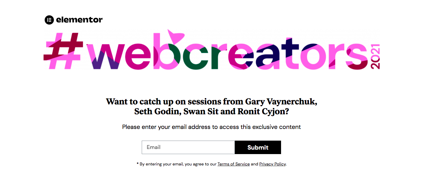
Credits: Elementor
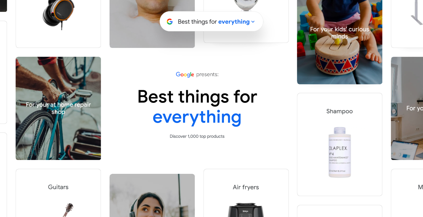
Credits: Google
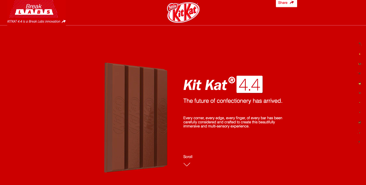
Credits: KitKat

Credits: Kocha

Credits: Marty
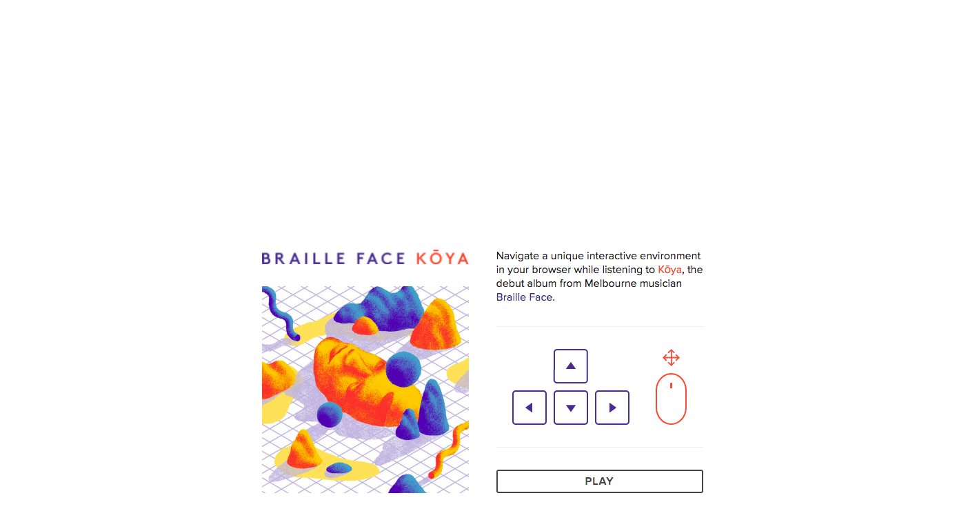
Credits: Braille Face
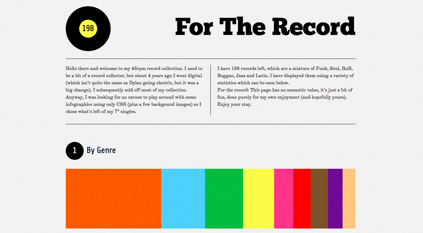
Credits: For The Record
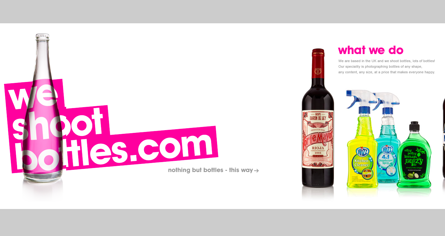
Credits: We Shoot Bottles

![Advantages Of Paperless Board Meetings [+ Tips] Advantages Of Paperless Board Meetings [+ Tips]](/sites/default/files/styles/all_blogs_block_img_384x192/public/image_1578.png?itok=Ah-vnnvq)
![PayPal for Nonprofits: A Guide to Accepting Donations and Managing Your Money [with alternatives] PayPal for Nonprofits: A Guide to Accepting Donations and Managing Your Money [with alternatives]](/sites/default/files/styles/all_blogs_block_img_384x192/public/image_1807.png?itok=ujDAsFNj)