
Once you have established a strong topic for a webinar, you can start to create a landing page that serves as an enetry to it.
All webinars need a landing page where guests can register for an event. It is where the audience gets to identify their current problems that need to be solved. Also, it works as a source for collecting valuable lead information.
However, it takes a significant amount of time and effort to build a webinar landing page that converts. You need to start paying attention to what you want to accomplish and the message you want to send to the audience for it to be successful.
In this article, we will give you some effective ways to build webinar landing pages that can help you turn visitors into registrants.
What Is a Webinar Landing Page?
A webinar landing page is a web page that generates registrations for a specific topic with the goal to convert webpage visitors. A landing page usually has no website navigation compared to a webpage.
It tells readers what the webinar is all about and explains the benefits they can get from it. Additionally, it aims to create a desire to attend the webinar and encourage people to register.
Other than learning about some webinar strategies for success, you also need to equip yourself with some valuable tips to create an effective and appealing landing page for the audience.
It’s a great tool designed to increase retention and protect your community’s information.
1. Write a Clear and Catchy Headline That Gets Visitors to Stay
A good headline is simple, straightforward, and to the point. Effective headlines can easily connect with visitors as soon as they arrive on the webinar landing page.
Using language that is appropriate and specific to your target audience is a must as it affects the click-worthiness of a headline.
Choose simple but impactful language in the headline. For example, transform headlines with call-to-action words such as “Get X Now” or “Start X Today.”
Once you’ve come up with a well-thought-out headline, you can use a tool like MonsterInsights to check if it’s compelling enough and there’s a need for improvement.

2. Write Emotionally Engaging and Compelling Body Copy That Captures Attention
To produce a high converting webinar landing page, the information on the body copy should focus on converting visitors into registrants.
Words and phrases like “you,” “your,” and “yours” should be included to help you speak directly to readers.
To encourage the audience to take action, you need to use active language in the body, making the statements direct, easier to understand, and concise.
There’s no need to oversell the webinar you are about to launch. Meaning, it would not help if you make others feel like you’re making a promise only for you to persuade them to register.
Ensure to include the webinar’s selling points and benefits. Maintain consistency all throughout to make it more polished and professional. Write keywords naturally in the body that can effectively turn the copy into a conversation.
Use customer testimonial videos that work as social proof in creating trust. For example, place testimonials above call to action to encourage visitors to stay on the page and give them the right reasons to take the desired action.
If you want to produce a compelling copy that can capture readers’ attention and drive them to register or sign up:
- Build a content strategy that focuses on content flow from the beginning to the end of the landing page to motivate the audience effectively.
- To encourage the audience to sign up, use the scarcity principle in the copy by letting them know that you can only allow limited attendees.
- Set a deadline for the audience to stimulate action from urgency.
- Use a strong command verb in your CTA that tells readers exactly what they need to do next. Call-to-action words like “Join Free” and “Learn More” are just some examples.
- Avoid a wall of text in the copy, so it’s best only to include engaging, relevant, and inspiring content.
Lastly, it’s crucial to test the optimization of the landing page for search engines. Therefore, performing an on-page SEO test is necessary.
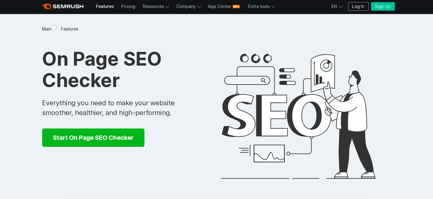
SEMRush's on-page SEO checker is a great tool to help you analyze the landing page, increase traffic, and rank higher in the competition.
3. Use High-Quality Images To Make Visually Appealing Webinar Landing Pages
The first thing the audience notices on a webinar landing page are the images and the colors. 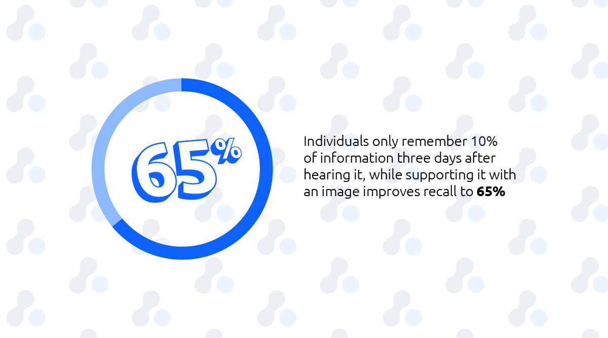
According to MDG Advertising, individuals only remember 10% of information three days after hearing it, while supporting it with an image improves recall to 65%. Images are also the most important type of content, ahead of text and video.
For this reason, the application of good visuals is critical to creating an effective one that converts.
Pick images that show relevance and speak to the audience genuinely. In addition, they should complement the landing page's color scheme and contribute to the overall message.
Limit the use of images as too many can create clutter on the landing page. In return, it can disappoint visitors and risks conversion loss.
Building trust is essential to convert a visitor into a lead. Therefore, images need to project professionalism and convey that your company is reputable and trustworthy.
Adding a video and images that support body copy can also help you gain the audience's trust. For example, a video on your landing page can increase the conversion rate by 80%.
Therefore, producing a creative video that welcomes visitors and explains the information they will get from the webinar would be a good initiative.
On the other hand, incorporate testimonial photos of speakers and past clients. A header image behind the headline can work as support to the topic at hand.
4. Include a Click-Worthy Call to Action That Converts Visitors Into Leads and Paying Customers
A call to action (CTA) is a written directive that encourages visitors to take the desired action. It is what makes visitors convert by guiding them on the next step to take in their journey on the webinar landing page.
It may be in the form of a text hyperlink, button, or plain text with no link. Typically, a call to action button should stand out on the page.
To improve the user journey on the landing page, make sure that you do the following on the CTA:
- Start the CTA with the desired action that focuses on value like “Grow Your Business.”
- Use the top suggested colors red, green, or orange.
- Add an arrow to your CTA that distinguishes it as a button and moves the user to the next part.
- Include a border around the CTA button to accentuate the colors and draw the reader’s eye.
- Always focus on building new relationships and getting registrations to a webinar.
5. Pick the Right Landing Page Builder That Saves You Hours
The best landing page builders allow you to create effective and well-designed landing pages to increase conversions.
In addition, they often offer pre-built templates that have already been proven effective in capturing fresh leads and helping organizations reach their goals.
When choosing one, list down all your requirements and find one that suits the personalization you need.
If you want to set up high-converting landing pages for events or webinars, book a demo of Glue Up's Event Management Software. With it, you can easily send out webinar invitations, create custom registration forms, offer different payment options to registrants, and add agendas and speakers in a few clicks.
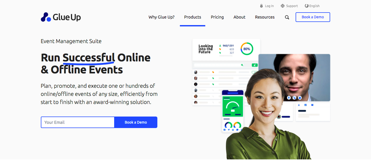
What’s great about the event platform is that it offers pre-built templates that can provide the level of personalization you seek.
5 Examples of Landing Pages That Can Increase Webinar Conversions
If you are looking for some inspiration when creating better landing pages for webinars, below are some examples that can also help generate maximum registrations.
1. Slack
What they did well:
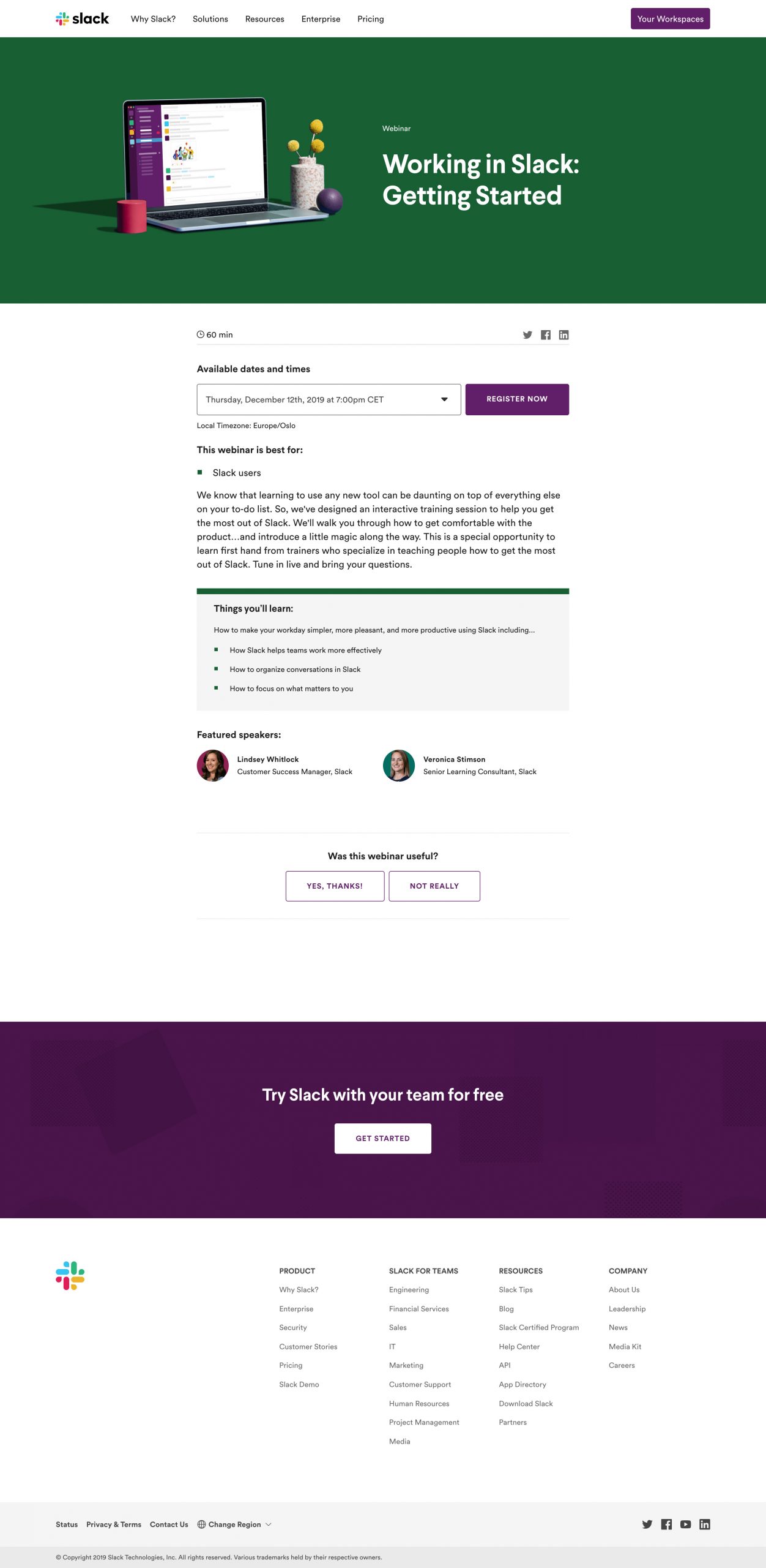
- Webinar title — The webinar title gives a clear idea of what the audience can expect from the webinar.
- Who it is for — It identifies Slack users as the target audience for the interactive training session that can help them get the most out of it.
- Things to learn section — The section talks about the advantages and benefits of attending the webinar when it comes to working effectively as a team, organizing conversations, and focusing on priorities.
- Body copy — The body is clear, simple, and uses conversational language. It also contains details like date, time, and featured speakers.
- CTA button — The CTA button inspires users to take action with the words “register” and “now.” It’s clickable and uses a color that contrasts with the landing page.
2. HubSpot
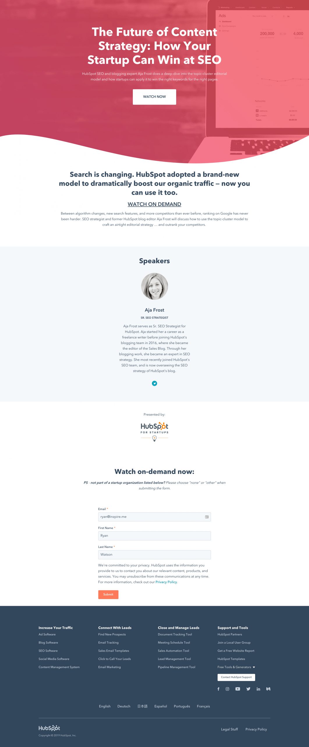
What they did well:
- Webinar title — Aside from being clear and straight to the point, the title offers solutions to solve a problem and gives context clues.
- Body copy — It tells users key ideas they'll get from the webinar that mention the valuable benefits they can obtain.
- CTA button — It has a well-crafted CTA that encourages readers to watch the video right away.
- Mobile responsive — The spacing signals that the landing page is responsive and mobile-friendly.
- Host information — The details about the host make the webinar more exciting, establish the organization's webinar authority, and improve the speaker's credibility.
3. GetResponse
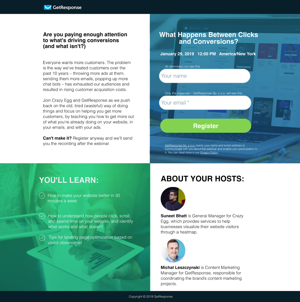
What they did well:
- Webinar title — It uses a simple and straightforward messaging approach.
- Body copy — It tells users key ideas they'll get from the webinar that mention the valuable benefits they can obtain.
- CTA button — A green button that incites feelings of confidence and movement encourages visitors to register.
- Speaker information — Speaker credibility is an important and integral part of a landing page, and every speaker's background and expertise are highlighted.
4. WordStream

What they did well:
- Webinar title — The webinar title uses a straightforward strategy with related keywords to the topic at hand.
- Body copy — The well-written and persuasive body copy discusses the benefits of attending the webinar, like excelling in a competitive market and improving the ROI of mobile campaigns.
- CTA button — It has a striking orange CTA button color that makes it noticeable and actionable for visitors to click and register.
- Speaker biography — Speaker bios are brief but highlight each individual's professional strengths in bullet points, helpful when skimming all the details.
5. Search Engine Journal
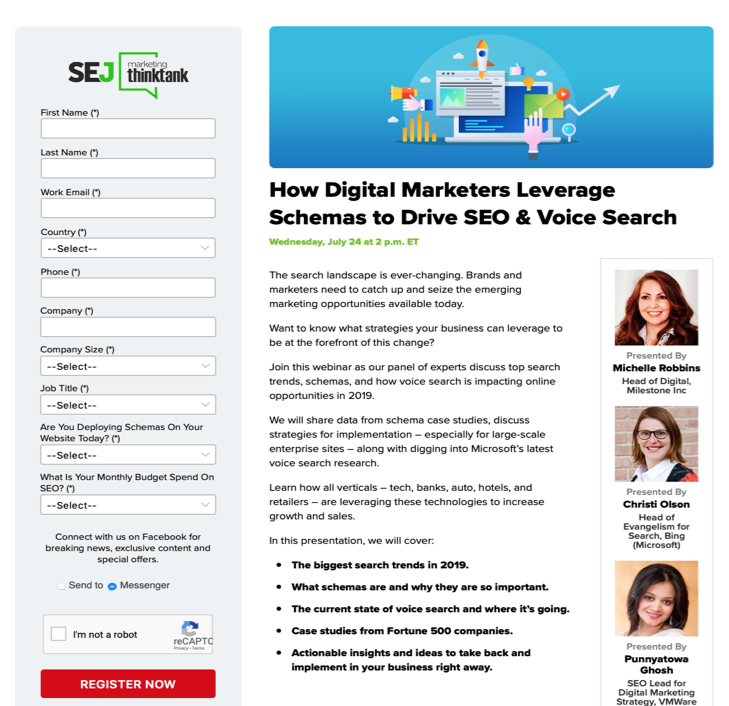
What they did well:
- Company logo — The company logo is simple, yet distinguishable.
- Webinar title — It has an impactful title that connotes a timely topic to motivate the audience to perform the desired course of action.
- Webinar description — It contains the purpose of the webinar, the event agenda, and new knowledge that the audience can benefit from.
- Bulleted list — The effective use of bullet points signals the information they can get from the webinar.
- Webinar speakers — Information and high-quality photos of speakers appear on the webinar landing page.
- CTA button — The color red and the “now” in the CTA button invoke excitement and urgency on the next step to take.
Create the Perfect Webinar Landing Page to Maximize Conversions
Landing pages and webinars work hand in hand to successfully launch online events that can generate more leads and reach more prospects. For this reason, a landing page for your webinar is essential to get people to register and attend. It should be well-crafted and optimized for maximum conversions.
Now that we have provided the most effective ways to create the best landing page, we hope you’re now more than ready to build one that can turn website visitors into engaged registrants for your next web conference.
Are you looking to enhance and monetize your online events and webinars? Book a demo of our Webinar Management Software now. We’ll show you how you can offer online attendees a premium and seamless experience, especially when they join and participate in webinars.


